Choosing the Right Paint Colors for Your Home: A Room-by-Room Guide
Color sets the mood, shapes the space, and tells your story—one room at a time. In this guide, we walk through each area of the home with tips on choosing paint colors that reflect your style, enhance natural light, and create the atmosphere you want. Whether you're going bold in the kitchen or soft in the bedroom, this post helps you paint with purpose.
INTERIOR TIPSBUILDING CONSTRUCTION


Setting the Mood in Bedrooms
When it comes to selecting paint colors for bedrooms, the overarching goal should be to create a serene and intimate atmosphere conducive to restful sleep. Colors in this space can significantly influence mood, relaxation, and overall well-being. Therefore, careful consideration is necessary to achieve an environment that nurtures tranquility.
Soft, muted shades are among the best options for bedroom walls. For instance, light blues and greens evoke a sense of calmness reminiscent of nature, promoting relaxation. Colors such as lavender and pale pink also serve to add a gentle touch, creating a peaceful sanctuary. These hues can help lower stress levels and encourage a gentle transition to sleep, fostering an intimate ambiance that invites rest.
Moreover, the psychological effects of color should not be underestimated. A warm beige or muted earth tone can create a cozy environment, making individuals feel safe and secure. These colors possess a grounding quality that helps promote relaxation, facilitating a deeper connection with one’s personal sanctuary. Incorporating these shades can enhance the overall feel of the bedroom while complementing various decor styles.
It is also important to consider how different shades may interact with the lighting in your bedroom. Natural light may enhance or soften certain colors, so testing paint samples at different times of the day can offer valuable insights. Ultimately, the chosen colors should reflect personal preferences, ensuring that the bedroom remains a unique space tailored to individual needs.
By selecting colors that combine aesthetic appeal with psychological benefits, homeowners can create a bedroom environment that promotes both relaxation and intimacy, thus achieving a perfect balance that supports restful sleep.
Understanding the Psychology of Color
Choosing the right paint colors for your home goes beyond mere aesthetics; it involves an intricate understanding of how color influences human emotions and behavior. Colors can create a specific atmosphere in any given space, directly affecting mood and feelings. For instance, warm tones such as reds, oranges, and yellows evoke sensations of energy and warmth, often encouraging social interactions and creativity. These colors are typically well-suited for spaces such as dining rooms or living areas where activity and conversation flow freely.
In contrast, cool tones—like blues, greens, and purples—often promote feelings of calmness and tranquility. These colors can create an inviting, serene atmosphere, making them ideal for bedrooms and bathrooms where relaxation is paramount. The use of cool tones in a space can lead to a soothing environment, encouraging restfulness and lowering stress levels. The psychological effects of color are profound, with research indicating that these shades can even affect heart rates and blood pressure, further underscoring their significance in design choice.
It is essential to consider the specific function of each room when selecting paint colors. For example, a workspace might benefit from brighter hues to stimulate productivity, while a relaxation area might be better suited to subtle, muted colors to enhance comfort. Additionally, the impact of color can vary based on individual preferences and cultural contexts. Therefore, it is crucial to take personal taste into account when integrating color psychology into your home design. By understanding how different colors influence moods and ambiance, you will be better equipped to make informed decisions that align with the atmosphere you wish to cultivate in each room.

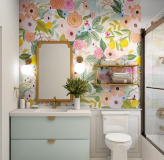
Creating Serenity in the Bathroom
When designing a bathroom, the choice of paint color plays a crucial role in establishing a tranquil environment. A well-chosen palette can transform an ordinary bathroom into a serene retreat, ideal for relaxation and rejuvenation. Soft and calming colors such as light blues, greens, and muted neutrals are particularly effective in creating this soothing atmosphere. These hues emulate the natural elements found in nature, contributing to a sense of peace and harmony.
Light blue shades evoke a sense of calm reminiscent of clear skies or tranquil waters. They can make a small bathroom feel more spacious and airy while promoting a soothing ambiance. On the other hand, soft green colors resemble lush foliage, instilling a connection to nature that can enhance one's overall sense of well-being. Additionally, with modern design trends leaning towards minimalistic and spa-inspired aesthetics, these colors can seamlessly complement various bathroom styles, from contemporary to traditional.
To further enhance the serenity of the space, consider incorporating complementary elements such as plush white towels, natural wooden accents, and lush greenery. These elements work harmoniously with calming paint colors to amplify the tranquil experience. Moreover, when selecting a paint finish, opt for satin or eggshell, as these finishes are not only easy to clean but also offer a subtle sheen that reflects light, enhancing the overall serenity of the bathroom.
Ultimately, the right choice of color can significantly influence the atmosphere of your bathroom. By often using shades like soft blues and greens, homeowners can cultivate a spa-like retreat where relaxation reigns supreme. This thoughtful selection ensures that the bathroom serves not merely as a functional space but as a peaceful oasis within the home.
Choosing Colors for the Kitchen
The kitchen serves as one of the most vital spaces in a home, often where families gather not only to prepare meals but also to share stories and create memories. Therefore, selecting the right paint colors for this room can significantly influence both the atmosphere and functionality. Bright and inviting colors are known to stimulate appetite and encourage conversation, making them ideal for a culinary setting.
One of the most popular color choices for kitchens is yellow. This color evokes feelings of warmth and happiness, promoting a cheerful ambiance while enhancing natural light. Soft yellows can create a calming backdrop, while brighter shades can infuse energy into the space. Pairing yellow with fresh accents like white can amplify the room’s brightness and maintain a clean, airy feel.
Green is another excellent option that reflects freshness and vitality. Often associated with nature, shades of green can bring a sense of tranquility to the kitchen while complementing themes that include herbs or plants. Lighter greens, such as mint or sage, can provide a soothing effect, while darker greens, like forest or hunter green, offer sophistication and depth.
Whites and off-whites should not be overlooked, as they serve as versatile foundations for any kitchen style. These colors can make a space feel larger and more open, which is particularly beneficial for smaller kitchens. Additionally, white can highlight architectural features or cabinetry, allowing for seamless integration with varied decor styles.
Combining these colors thoughtfully can result in a harmonious kitchen environment that enhances the culinary experience. Whether you opt for vibrant accents or soothing tones, the key is to choose colors that resonate with your personal taste while fulfilling the kitchen's essential functions. Through careful selection, the color palette of your kitchen can truly elevate the heart of your home.


Defining Comfort in the Living Room
When selecting paint colors for the living room, it is essential to create an atmosphere that encapsulates comfort and relaxation. The living room is often the heart of the home, serving as a space for family gatherings, entertainment, and unwind time. Therefore, the choice of paint color can significantly influence the mood and feel of this central area.
Warm and inviting hues are typically ideal for the living room. Shades such as soft creams, gentle beiges, and muted earth tones provide a cozy backdrop that encourages relaxation. These colors not only create an inviting ambiance but also serve as a versatile foundation for various furniture styles and decorations. For a more dynamic approach, consider incorporating warm pastel colors or light shades of yellow and peach. These colors can uplift the room while promoting a cheerful and soothing environment.
Combining multiple colors can also enhance the living space. A subtle palette that includes complementary colors can foster a sense of harmony and cohesion. For instance, pairing a soft gray with accents of taupe or a pale green can introduce depth to the space without overwhelming the senses. Additionally, accent walls are an effective design feature that can transform the living room. A bold color such as deep blue or rich burgundy on one wall can create a focal point, drawing attention to specific elements of the room while contributing to an overall cohesive design.
To achieve the desired comfort in your living room, focus on selecting colors that resonate with your personal style while promoting a sense of warmth and relaxation. The careful integration of inviting hues, thoughtful combinations, and accent walls can significantly enhance the overall aesthetic and comfort of the space, making it a perfect retreat in your home.


Hallways and Stairs: Transition Spaces
Hallways and stairs frequently represent the transition spaces within a home, serving not only as conduits between rooms but also as vital areas in their own right. The choice of paint colors in these areas can significantly influence the overall flow and aesthetic of your interior. When selecting colors for hallways and stairs, it is essential to consider the interplay of light and space, along with the connection between adjoining rooms.
Opting for a continuous color palette can create a sense of unity throughout your home, allowing for a harmonious transition from one area to another. Neutral shades, such as soft grays, warm beiges, or light creams, can make hallways appear more spacious and inviting while also providing an excellent backdrop for artwork or decorative elements. These colors can reflect light effectively, enhancing the brightness and openness of often narrow and dimly lit spaces.
In addition to neutral colors, consider incorporating subtle accent shades that can draw attention to architectural features or add a personal touch. Soft blues or greens can evoke feelings of serenity and balance, making them suitable choices for hallways leading into bedrooms or tranquil spaces. For staircases, using slightly darker tones can provide visual depth while ensuring safety; a vibrant color on the risers can create a striking contrast and make the staircase a focal point.
Ultimately, the goal is to create an engaging and cohesive experience for anyone traversing through these transitional areas. Thoughtful color choices can not only enhance the overall design of your home but also improve the flow between adjacent rooms, creating a sense of continuity. By carefully selecting colors for hallways and stairs, homeowners can achieve both functionality and style in these often-overlooked spaces.


Choosing the Right Colors for Your Home Office or Study
Selecting the ideal paint colors for your home office or study is crucial in crafting an environment that fosters productivity and creativity. The right hues can significantly influence your mood and focus, ultimately enhancing your work output. A well-considered color scheme does not just appeal aesthetically; it also plays a vital role in balancing energizing tones and calming shades to create an inspiring space.
For those aiming to increase productivity, colors such as soft greens, blues, and yellows are often recommended. Soft green, reminiscent of nature, promotes tranquility while providing an underlying energy that can keep you motivated. Meanwhile, light blue fosters a sense of calm and clarity, making it easier to concentrate on tasks and think creatively. On the other hand, yellow, a bright and cheerful hue, can energize the workspace, sparking innovation and keeping spirits high.
However, selecting colors that are too vibrant or dark can lead to distractions or feelings of unease. Therefore, while deep blues or bold reds might add personality, it is advisable to use them sparingly as accents rather than primary colors. Incorporating these hues in smaller areas—such as an accent wall or decorative features—can allow for vibrancy without overwhelming the senses.
Additionally, consider the lighting in your office. Natural light can display paint colors differently throughout the day, altering their emotional impact. As a result, testing paint samples on your walls is a valuable step before making a final decision. By exploring the balance between energizing hues and calming tones, you can create a productive and harmonious workspace that inspires creativity and focus, thus making your home office a truly effective environment.


Paint Your Story with Hedgie Wilder
Every color choice is a chance to shape the mood and make your home truly yours. At Hedgie Wilder Home & Garden, we share inspiration, practical tips, and creative guidance to help you choose shades that reflect your personality and bring harmony to every room. Explore our main pages to discover more ideas, services, and resources that make painting with purpose both simple and rewarding.
© BluQ EOOD. С корени в семейството. От нашия дом до твоя